
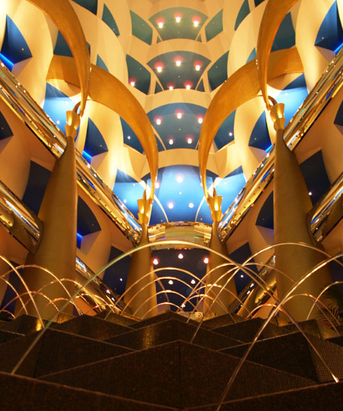
Let us look inside the hotel Burj Al Arab that we talked about a month ago. It is designed pretty crazy. As you noticed almost everything is designed by repetition and similarity. Let’s start from the bottom to the top of the image. Looking at the water fall how it’s making a half oval shape and the three dimension look of the square it’s coming out from with a repetition gives it a nice depth view. The windows that are in every floor are being repeated with the same design giving the hotel a beautiful view from the bottom. The colors that are being used are supplementary colors that are brown, gold and dark/light blue. The building color starts from the bottom with dark brown and as it goes up, the color gets brighter until it gets to gold. Very similar with blue lighting, the hall ways are dark blue while the outside lighting is light blue. The colors are connected by transition. The brown and gold color gives a sense of warming and comfort. Using colors with transition and the similarities of the building structure gives it a sense of unity. Notice how the bright blue color in the center is a focal point of the image.
(Picture taken from: http://www.transit-port.net/Galleries/Dubai/images/Burj.Al.Arab.Pattern.jpg)
No comments:
Post a Comment